3 Interior Design Color Schemes – Inspired by Scandinavian Nature
During my interior design studies at the Interior Design Institute, I was given the task of crafting three distinct color schemes, each belonging to different color harmony groups. Drawing inspiration from the serene beauty of Scandinavian nature, I created the following palettes:

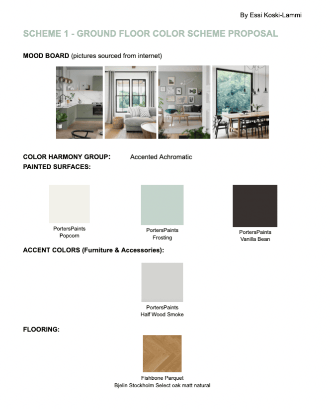
This house is for people who want to step into the spring forest and flower field to enjoy the lightness of nature.
In this accented achromatic Scandinavian-style home, the focus is on white color with a touch of black, green, and gray. The walls are white in the entry (front and back entry), kitchen, dining, and living room. But to keep the white walls more interesting, the TV & games room and the office are painted with the accent color, Frosting green, instead of white.
The window frames and the stair handrail will be painted black to emphasize them, make a more dramatic look, and frame the beautiful nature that can be seen from the windows.
The kitchen cabinets will be a shade similar to the Frosting green.
The furniture will be white, black, and oak wood color. The accent colors – green & gray – can be found in the accessories and fabrics.

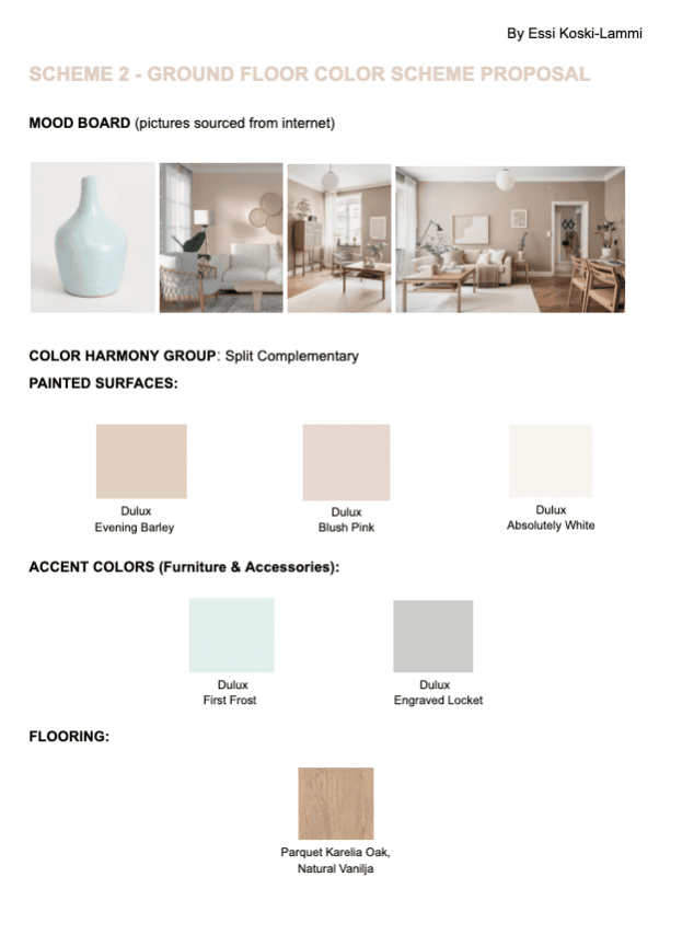
This house is for people, who want to ground their energy at home and be connected with earthy vibes.
This house is designed using a split complementary color scheme, focusing on a warmer, grounding earthy vibe with Blush Pink color in the walls of the TV & games room and the Office. The walls of both entries, kitchen, dining room, and living room, are Barley colored. All walls have ‘easy’ matt finishes to highlight the earthy feeling. White color is also used in ceilings, boards, etc., and the kitchen cabinets will be white. The mudroom and toilet walls are also white.
However, the earth needs water! So the contrast is brought by the light blue-green accessories, fabrics, and furniture. Gray is also introduced in small amounts, mainly in patterns on the carpet or pillows. The floor will be again wooden, oak parquet, and the shades of the oak can also be found from the furniture.

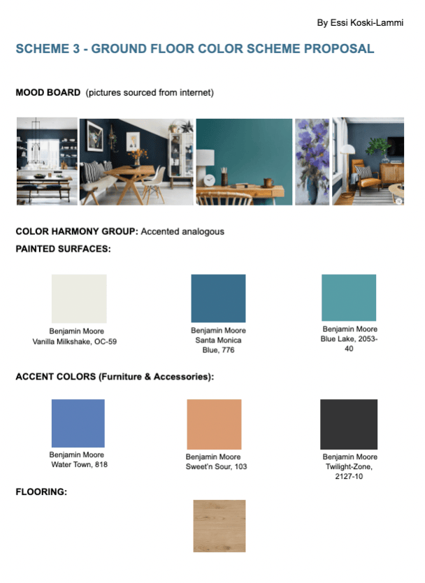
This house is for people who want to enjoy all that Scandinavia has to offer: dark starry sky, bright snow and blue-green summer ocean and blue-violet flower fields.
Scandinavian people would love to use darker and more bright colors for home decor than the typical white, beige, and gray they are used to. The problem is that people are afraid and do not know how to combine the colors. However, I grew up in a home where the rooms were all different colors (some darker), yet harmoniously they fit together. That inspired me to challenge myself and create this 3rd color scheme with bold color choices to show that you can add dark blue, blue-green, blue-violet, and orange together and still have a beautiful Scandi vibe.
This 3rd scheme is created by using accented analogous color harmony group. However, due to the open plan kitchen/dining/living room, I only used dark blue and darker blue-green on the walls and left the blue-violet to play a leading role in the accent colors, together with orange and a touch of black.
Both entries, kitchen, dining, and living room walls are in Santa Monica dark blue. The kitchen cabinets will be white, and the parquet floor will be oak. The TV & games room and the office walls are Blue Lake blue-green colored. Again the ceiling, skirting boards, window frames, cornice, etc, are white.
As Scandis are not used to using these colors, finding mood board pictures with this color scheme in Scandi style was challenging!
Essi Koski-Lammi
Essi Koski-Lammi is an Inner Alignment Coach, Intuitive Healer, Channeler, and Interior Designer who started studying energy work and life coaching over 20 years ago. Now, she helps New Earth Creators create a conscious lifestyle to find their way home to themselves and unleash their true nature for life without limits. In her approach, she also brings her interior design skills into play, helping her clients create a home aligned with heart and soul.


You may also like

5 home decor tips that heal your Solar Plexus chakra
May 20, 2022
A Case Study: Master Bedroom Redesign in Finland – The Sanctuary of Rest
January 2, 2024
